Oxford Lasers Website
Drupal Website Backend and Design
In 2007, Oxford Lasers needed a new website to replace the old, tired one that they had at the time. I realised that one of the reasons that the existing site had been abandoned was that the pages were written in software that no-one remaining within the company knew how to use. This fact, coupled with my desire to allow multiple people within the company to add and edit content on the site lead me to decide to use a content management system for the website.
The site contains multiple sections, and different types of information including product information pages, service information pages, pages describing techniques and ideas, data sheets. Because several different types of page were required, I realised that the content management system had to be flexible enough to accommodate different designs. I spent a good amount of time evaluating the various systems that were available at the time before settling on Drupal. I chose Drupal because the main competitors at the time (Joomla, Wordpress, and Moveable Type) all seemed to be too restrictive in terms of the way that I could theme and lay out the pages. Drupal allowed multiple page types and layouts that could be themed with minimal effort.
Page Types
I decided that multiple page types would be required to adequately cover the variety of information that I wanted to put onto the site.
Page types included:
- Technique description
- Product page
- Event or show date and information
- Company new item or press release
- Knowledge base page or technical paper download
Structure
Since Oxford Lasers is divided into two divisions, each with their own branding and products, I used the taxonomy feature within Drupal to categorise each page into its relevant division, and section. This means that the person entering the page data just has to picks set of keywords and descriptions that best match the page, and the site will automatically place the page in the correct location. It’s also possible to enter the preferred menu listing position and have the page entered into the menu structure in the correct way.
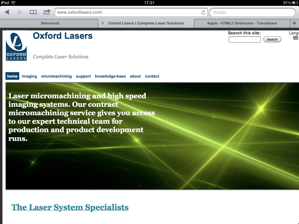
The home page design was intended to be very quickly readable by a first time visitor, and to answer the question “what do these people do?”. To do this, I used a single banner headline in the centre of the page with a two-sentence description of the company and its products. In order to maximise the amount of content for the purpose of efficient search engine optimisation, I also added a JavaScript scrolling gallery to the image. The mAin banner scrolls every 5 seconds to display a new image with text overlaid that talks specifically about the various divisions of the company. I used the JavaScript scroller smoothScroll, which has the added benefit that the text was written in plain HTML so was readable by search engine robots, even though it was overlaid on the images. I also added a clickHandler so that click anywhere in the banner led to the most relevant page (I.e. the one linked to from the main header in the banner div). These links are built automatically at page load, so the normal users of the site don’t need to know anything about how to add them. Finally, I added a a forward and reverse button in case a user was reading the banner whilst it was moving.
Within the various divisional home pages, I used Drupal’s view module to build relevant content dynamically. Tagging a page as a main topic page within the taxonomy system is all that is required to get a page onto the main divisional home page. Furthermore, since the taxonomy an have multiple values for a single page, you can have the page appear in multiple positions as is appropriate.
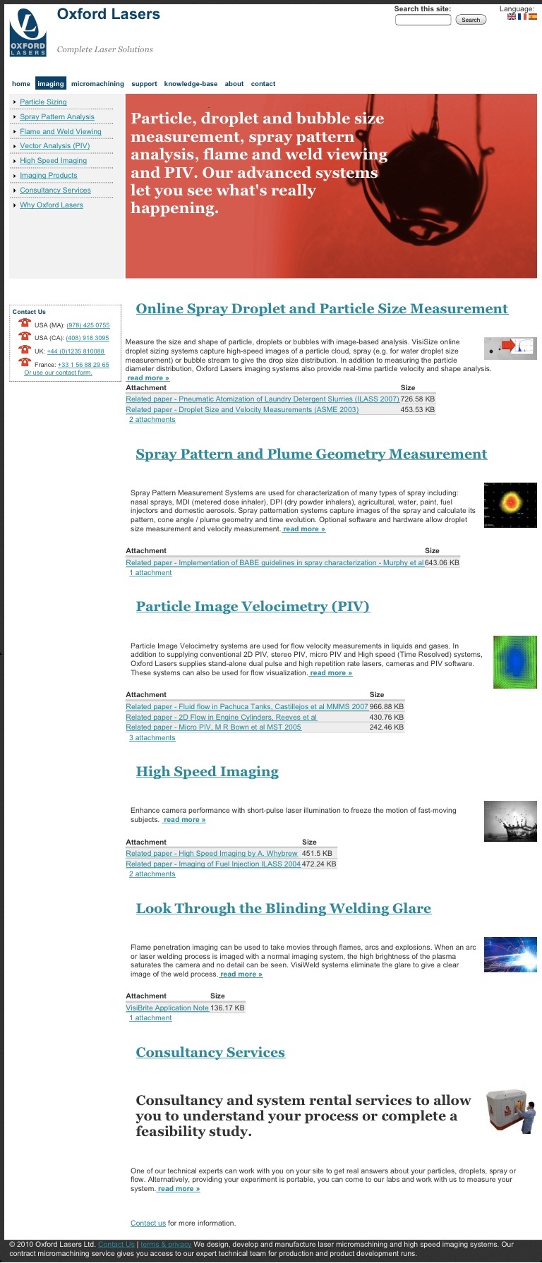
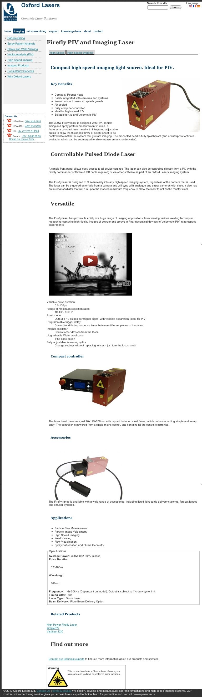
The different types of page have different types of content on them. For instance, a product page has system specifications, an applications section and a system key facts section whereas an events page has an event date section and a logo for the organiser’s conference logo. I used the template.php features within drupal to theme the relevant pages to make sure that they all appeared with the correct fields available and in the correct place in the site hierarchy.
Appearance
I wanted the site to have a clean, modern appearance and for it not to look too stylish (and therefore look dated really quickly). The main body of the pages is white, with a tall header to give a broad clean appearance and go highlight the presence of the navigation and search bars. The company logo is quite tall, which aids this spacing. Within each section, the secondary navigation is placed down the left hand side, in common with a lot of websites. On the divisional pages, a banner image is present to allow a large headline to be present. To keep the secondary navigation a consistent hit throughout all the pages, the tertiary navigation is handled with a tab bar inside the page beneath the main h1 section. This design helps to make the site readable and ensures that a customer can find the relevant section within the site quickly, and is then able to navigate within that section with the minimum of fuss.
To keep attention focused on the content, I used a dark grey border on the page that helped the content to stand out, and also reduced the weight and darkness of the various headlines and navigational elements where possible so that the words on the page stood out. After all, they are the most important thing on the site.
I took photographs of all our systems on the factor floor as they were going through assembly and then isolate them from their background and added drop shadows with the GIMP, a powerful open source photo editor. Because the original images are high-resolution and isolated from the background with layers, it will be easy to change the background colour of the site in the future without having to rework the images too much.
The beauty of using a content management system is that you can rework the information on a website very quickly, and because the content is divorced from the display, you can change to appearance by reloading the theme. I developed a custom theme for the site to prevent it from looking like a cookie-cutter CMS website, and to try and make the site as standards compliant as possible so that it rendered predictably in as many browsers as possible.
Modules Used
- CCK
- Book
- Content Translation
- Logging
- Help
- Locale
- Image
- Meta Tags
- Internationalisation (i18n)
- Custom Breadcrumbs
- Lightbox 2
- Nice Menus (for admin interface)
- Site Verification
- Webform
- Weight (to aid sorting in Views)
- Read More Tweak
- Google Analytics
- jQuery Update (for the front page scroller)
- Views
- XML Sitemap (for Google’s benefit)